
React components library for devs and designers
A browsable library of 100 animated, interactive React components — shipped as copyable source, not an installable black box. Preview a bit live, tune it, then paste the exact variant that fits your stack.
Open source · React · 2026
Visit the live siteThe component index
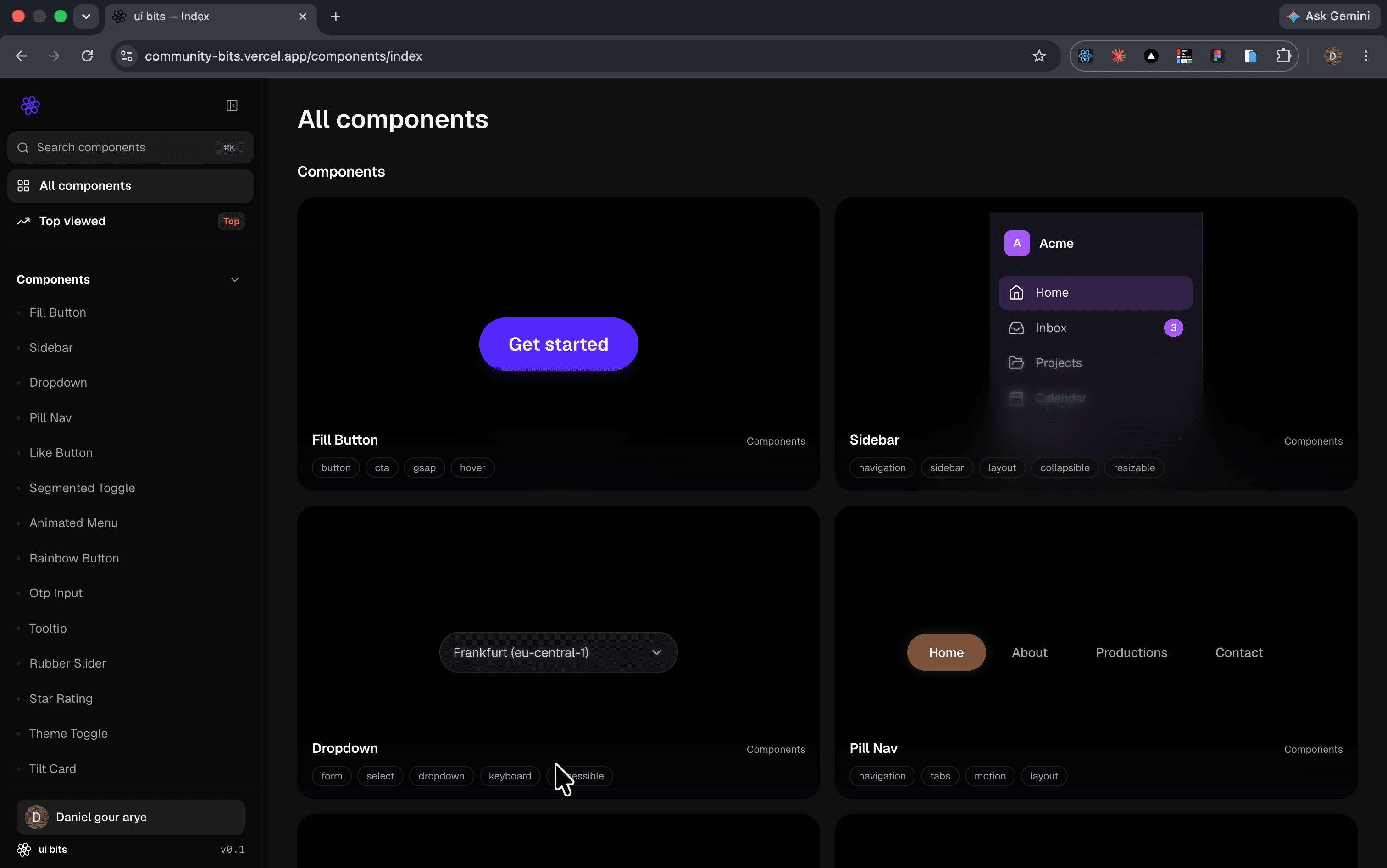
A persistent left sidebar carries the search field, an All components and Top viewed entry, then every component listed under its family. The main column is a two-up card grid: each card renders the component live inside its own canvas, with its name, its category, and a row of tag chips underneath.
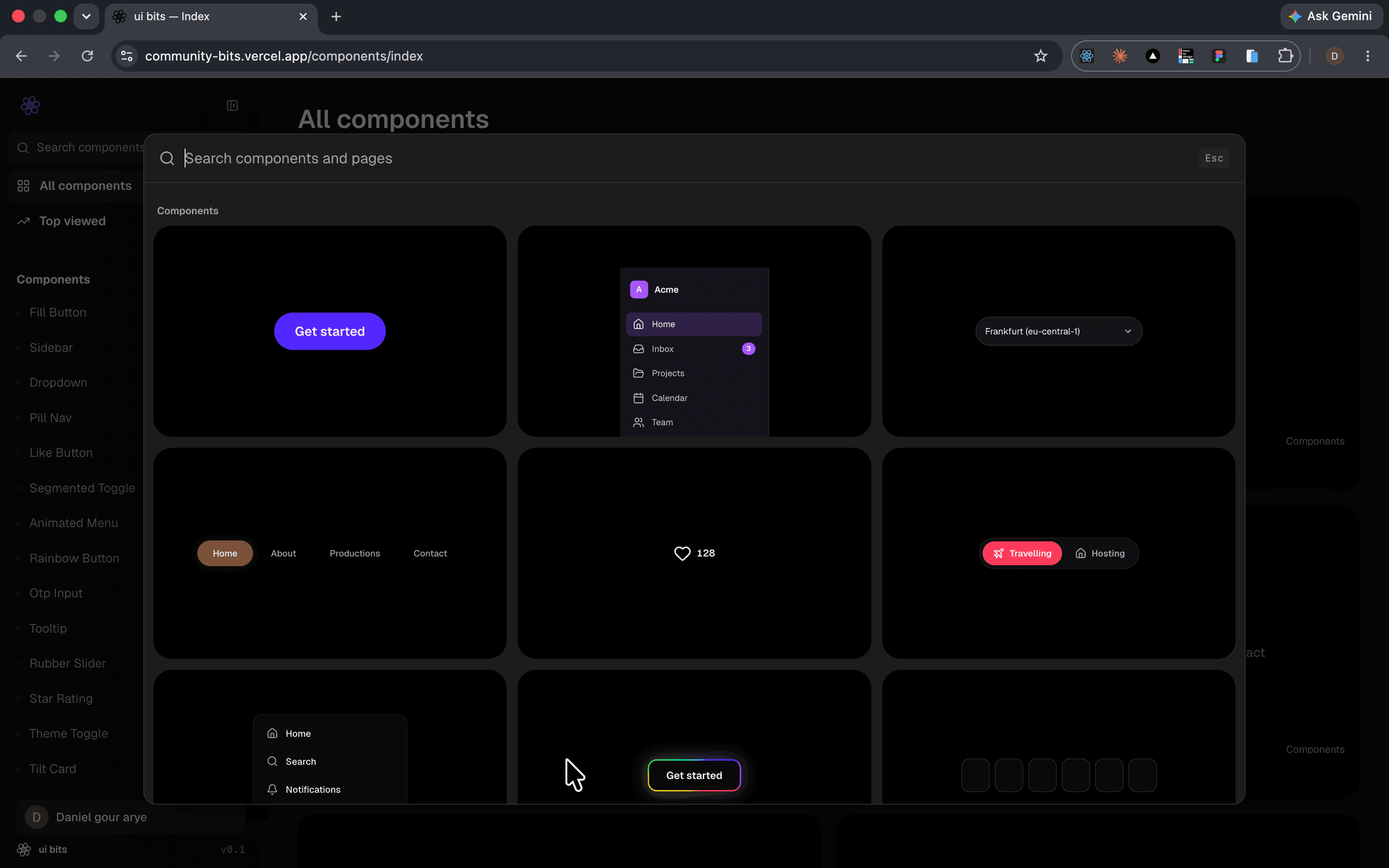
The ⌘K command palette
The palette mounts over a dimmed page. A single search field spans the top with an Esc chip pinned right, and the results render underneath as the same live component cards rather than plain text rows — so the grid stays recognisable while it filters.
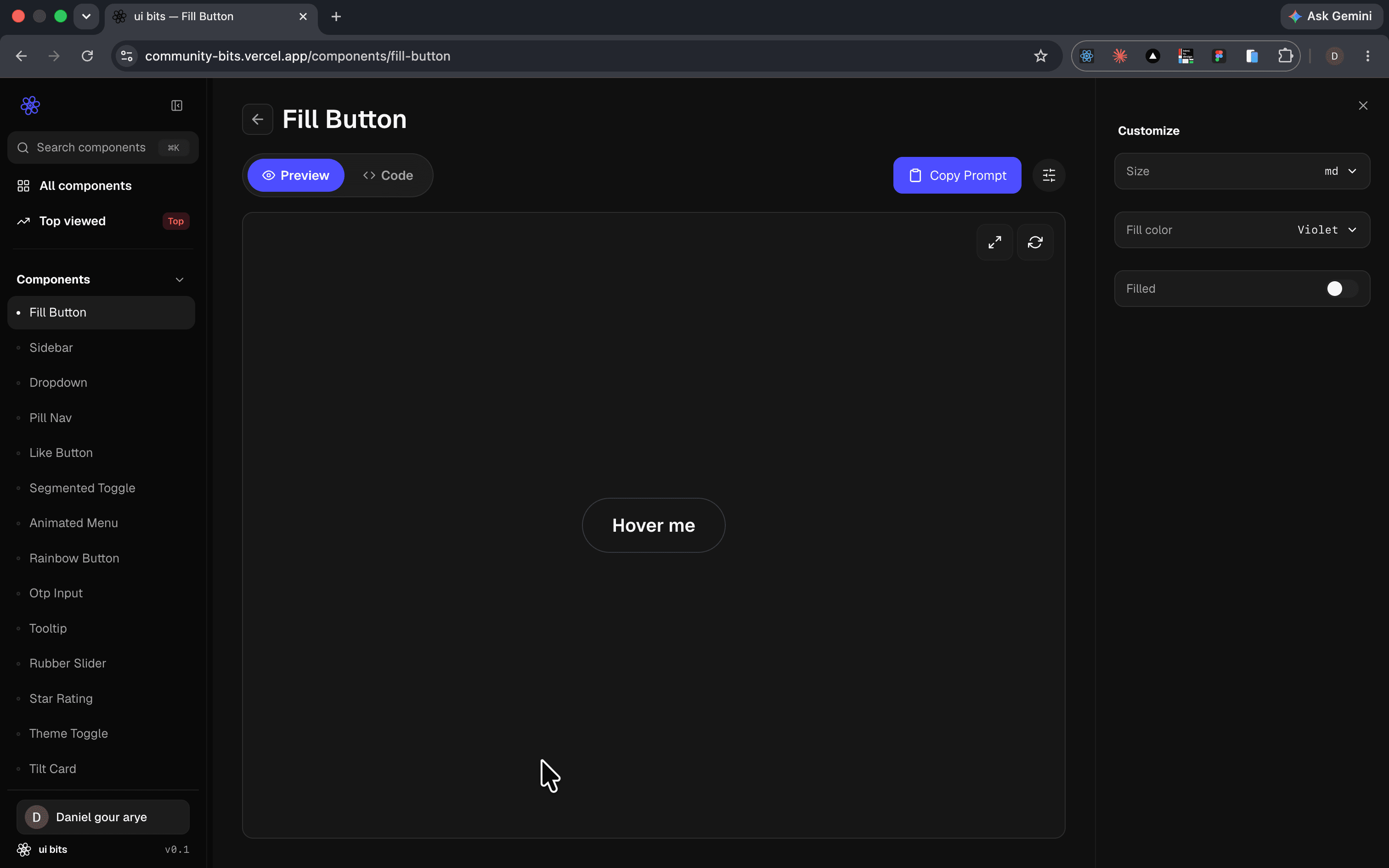
Preview canvas and customize panel
Each component opens onto a three-part layout: the sidebar on the left, the component running inside a bordered preview canvas in the middle, and a Customize panel on the right. A Preview / Code segmented toggle sits above the canvas, a Copy Prompt button opposite it, and expand and reset icons float in the canvas corner. Every meaningful prop appears in the panel as a real control — a size select, a colour select, a filled switch.
The controls drive the component
Nothing in the panel is a mockup. Changing the Track select swaps the record, dragging the Size and Spin speed sliders resizes and accelerates it, and the preview repaints on every frame of the drag — the canvas is the component, wired to the same props you'd pass in code.
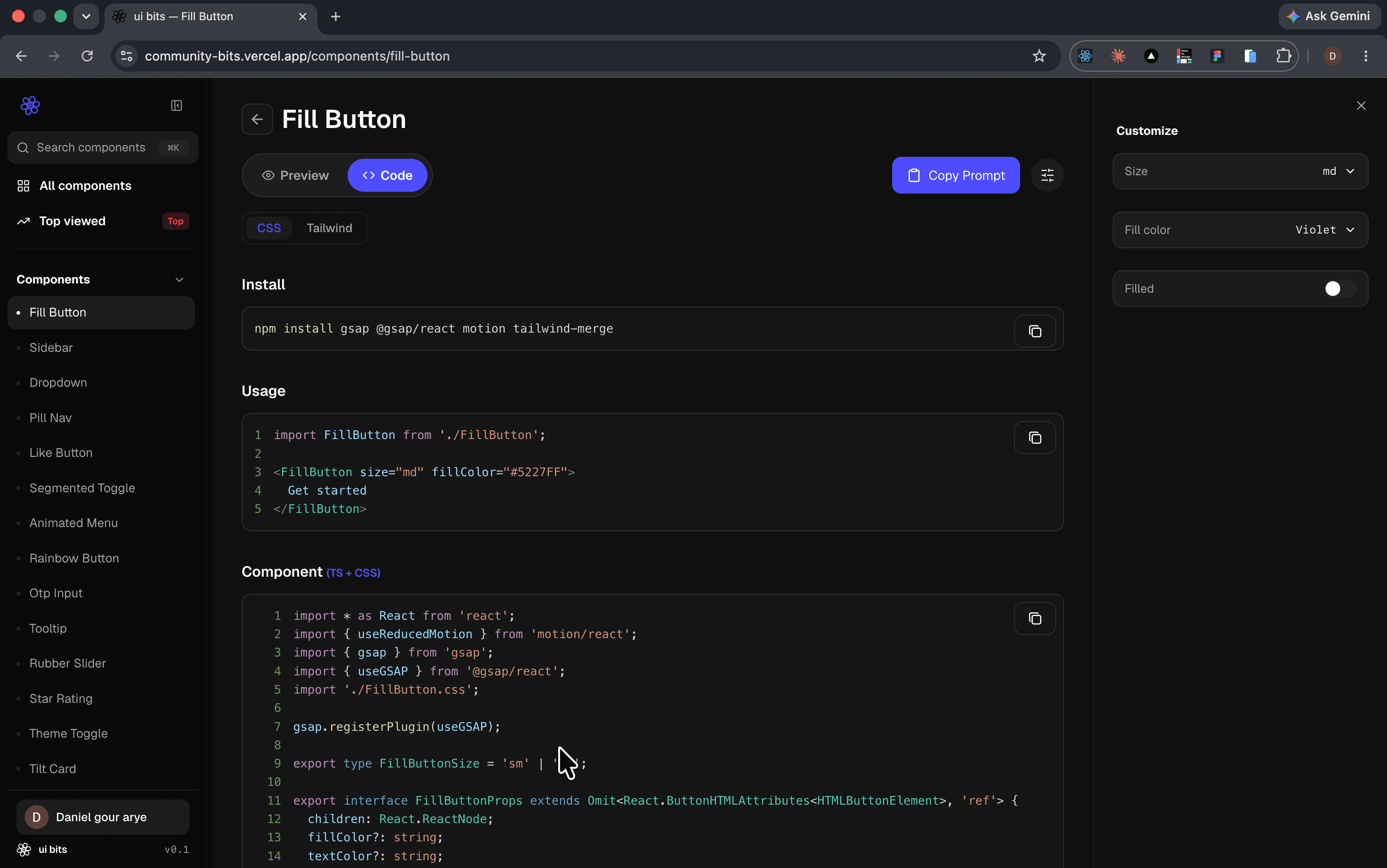
The code tab
The same page, toggled to Code. A CSS / Tailwind switch sits at the top, then three stacked blocks: the install command, a short usage snippet, and the full component source with line numbers. Each block carries its own copy button in the corner, so you take one piece or the whole file.
Copy Prompt and its confirm state
The primary action in the header packages the component — source, props, usage — as a prompt for an AI agent. On click the button swaps in place to a checkmark and Copied!, then settles back: the whole feedback loop lives in the button, with no toast and no dialog.
Let’s connect
I’m always open to discussing new projects, creative ideas, or opportunities to be part of your visions. Just reach out!